Apparently, presidential candidates really do care about
fonts. At least, their campaign managers do...
And, I just found this
album cover blog.
Labels: design, fonts, music, politics
Here's a little something of interest to our residing font snob.
I'm watching Orange Bowl right now (yeah, I've been watching waaaay to much football lately...but I'm making up for watching like 3 total games during the semester), and I've noticed that Kansas'
uniforms have become inexplicably dull. Not so much the uniforms, per say, but that
font. Christ, could there be a more boring font to use on a football uniform?
I did a little reserch and remembered reading on my daily
UniWatch update a little while ago that the university is
mandating that each of their athletic teams change their uniform fonts to Trajan, the new font that they're trying to impliment across the board at the school.
I know nothing about the viability of Trajan for normal use, but mandate is disturbing. Back in elementary school I used to like Kansas basketball (my mom went there for grad school so I had a strange attraction to them) and the uniform font looked like
this. It wasn't very clean, it certainly didn't look very modern, but I liked it. It gave Kansas a unique,
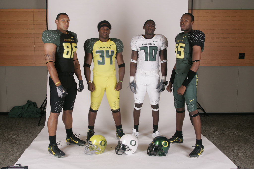
classic look that made them stand out from other college teams - most of whom now seem to go for stupidly sleek and futuristic. (Two of the worst offenders:
Oregon and
Miami.
This Trajan crap isn't as bad as all that, but it sucks the life out of football uniforms (the garish red alternates don't help that much either). Plus it's basically taken away Kansas' identity - If I didn't know any better, I might mistake them for
Saginaw Valley State.
Fortunatley it looks like Kansas fans are
wigging out to reinstate the old "circus font" back on the uniforms.
A quote from one of the website's creators, from
The Kansan:
“It is a well constructed font, speaking as a designer myself,” Kirkland said of Trajan. “But it is overused. It doesn’t mean anything; it doesn’t stand for anything. Certainly not our University. It doesn’t say Kansas Athletics.”
The site, created last week, offers a forum for fans to discuss the font issue.
It asks for a return to the “curling, arc-serifed typeface” (hehe...design nerds) that “subtly evolved into a unique symbol of Jayhawk pride.”
Just
compare this shit. What were those ass clowns even thinking?
At least they got an Orange Bowl win out of it.
Labels: fonts, football, uniforms